[Abridged for confidentiality]
01. Background
Context
In the rapidly evolving world of e-commerce, maintaining a consistent and seamless user experience across platforms is paramount. At Bose, where innovation in sound is key, I was tasked with transforming the design system into a strategic asset that would empower designers, engineers, and content creators.
I was hired in January 2024 by the head of UX due to my successful leadership in migrating a startup to a decoupled architecture and rebranding. Bose’s challenge was similar but on an enterprise scale. My goal was to build a scalable and robust system that could adapt to Bose’s growing digital presence and market demands.
Problem Definition
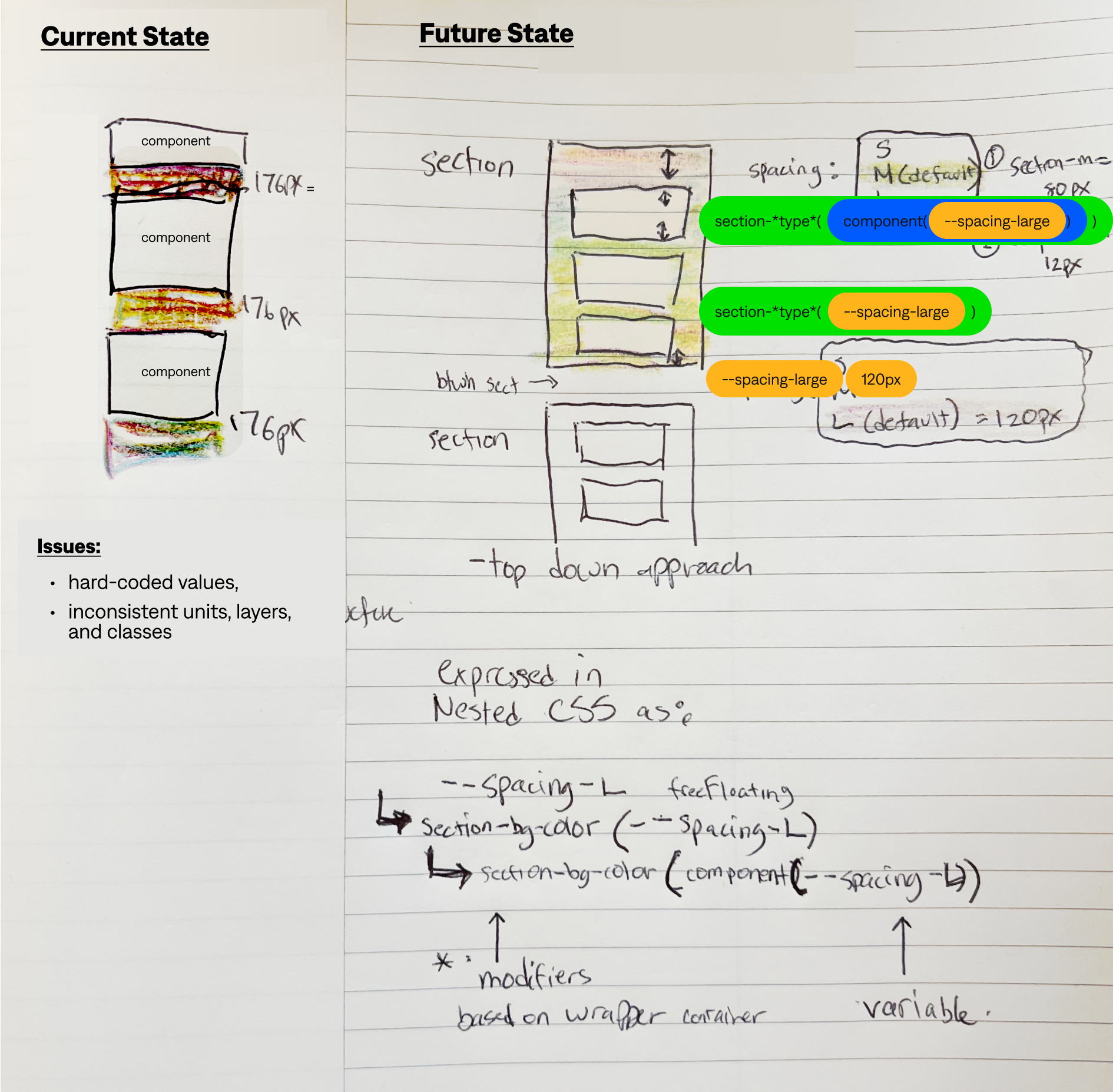
When I joined Bose, rapid growth and changes in business model led to fragmented product experiences and a backlog of design, development, and CMS debt.
On the design side, inconsistencies across platforms and a lack of standardization made it difficult to iterate on future state components. The engineering teams faced blockers due to unclear design specs, and the UX was suffering as a result.
Business Implications: These gaps were more than just technical issues—they were business risks. The inefficiencies were leading to longer development cycles, increased costs, and a user experience that was not meeting the premium product expectatations of Bose customers.
02. Discovery & Insights
Interviewing product owners revealed:
-
Different teams were using different versions of UI components, leading to inconsistent component usage and a disjointed user experience.
-
Engineers were struggling to interpret design specs which often led to sprint delays.
-
Legacy components, work in progress explorations, and unmerged updates to master components cluttered the design system to the point that UX designers were unsure what the most up-to-date assets to use were.
03. Strategy
Focusing on standardization, scalability, and enhanced collaboration between design and engineering and content authors,
I led a cross-functional team to overhaul the design system. By using adaptive layouts, responsive components, variables and tokens, and stronger governance protocols, we ensured that the system was both robust and flexible for future growth.
Bringing the vision to life:
-
Library Organization - I restructured the design system from a massive single-file library into a tiered-inheritance file structure following atomic design principles that allowed departments to pull in just the resources they need.
-
Component Remediation - We set up a process for designers to report and replace outdated components, driving the team toward a unified source of truth while keeping the system dynamic and responsive to user feedback.
-
Collaboration with Engineering - I worked closely with engineering teams to ensure that the components were not only technically feasible and visually consistent, but also easy to implement. By creating detailed design specs and maintaining open communication channels, we reduced the time engineers spent on interpreting designs by 40%.
-
Accessibility First - We implemented key accessibility practices, including:
-
- Optimized Color Contrast: Ensured all components met or exceeded WCAG AA standards.
-
- Keyboard Navigation: Designed with full keyboard support for users with motor disabilities.
-
- ARIA Labeling: Integrated ARIA attributes for enhanced screen reader compatibility.
04. Testing & Iteration
Continuous feedback loops between end-users and UX and CRO teams reduce design time by up to 30% with 25% faster time to market for new features.
- Alignment on naming conventions - between design, engineering, and content teams.
- Navigation label improvements - UserTesting moderated card sort study to understand how visitors think about navigating the website.
- Data-backed best practices - UX audit conducted by Baymard.
- Earlier testing phases and finding resourceful ways to validate components in real-world scenarios.
Outcome and Impact
Highlight: By mid-June, the successful launch of the 12-column grid and container rail system was recognized by leadership as a major achievement. This, along with improved internal collaboration on component updates, was a turning point in getting to a design system that could scale.
Results:
- Increased Efficiency: Reduced time spent on design and engineering alignment by 30%, enabling faster project delivery.
- Improved Onboarding - Accelerated team member onboarding by 25% through clear, well-documented processes.
- Enhanced User Experience - Achieved greater consistency across platforms, leading to higher user satisfaction scores and stronger brand loyalty.
- Faster Load Times - Optimized components led to a 20% reduction in website load times, providing a smoother, more responsive user experience.
- Improved Accessibility - Enhanced accessibility features resulted in a 15% increase in positive feedback from users with disabilities, making the site more inclusive and easier to navigate for all.